8 Moves To The Best Website For Your Chocolate Company
I often find myself giving advice to chocolate companies that asked for my opinion regarding their websites or Social Media accounts (I might as well just open a chocolate marketing agency!). Being of help to chocolatiers and chocolate makers is one of the most rewarding feelings I could ever get. This is why I like to write articles on the best use of Social Media like 10 Reasons why your chocolate company needs a FB page, or some good old Marketing advice like How the art of storytelling can help your chocolate business. So I thought, what can I help with next?
On this matter, my dear friend Antonella Tromba from Foodensity.com couldn't have had a better timing. With an email suggesting for me to write about how a well-made and effective website should look like, she gave me the hint I needed!
So I started digging deep into the websites of 20+ successful chocolate companies to find out what makes them thrive on the online market and how their websites are designed to raise sales. Therefore, let's have a look to get you some inspiration!
Learning from the best, here are 8 moves to better your chocolate company website:
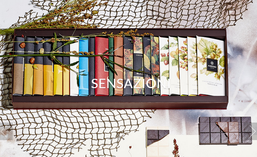
1) USE GREAT PICTURES - with nowadays fierce competition, you are going nowhere with low-quality and low-creativity pictures. If you don't know how to take amazing pictures yourself, hire a professional. This is the N.1 factor that can make or break your online sales. Take example from Amedei: beautiful pictures that can't pass unnoticed.
2) STATE YOUR MISSION - why do you make chocolate? What are the values of your company? Customers want to know who they are giving their money to. Nobody is interested in a cold website that only showcases products to be sold. Share you goals like Askinosie in a concise but effective way! Adding a video makes it even better.
3) INCLUDE MANY CALL TO ACTION - treat customers like children: tell them exactly what to do! The more indications you give, the more you can direct them where YOU desire. Give them the encouragement they need to either LEARN MORE about your company, FIND OUT your last collections or SIGN UP for your newsletter. Alter Eco does a great job in inviting customers to purchase their chocolate bars.
4) SHOW YOUR FACE - who is behind the creation of such beautiful chocolates? Put your shyness aside and strike a pose while smiling next to your chocolate creations. In this way you create a deeper connection with your customers that can now associate a face to their favorite chocolate. Take example from Santiago Peralta and his wife Carla Barboto from PACARI.
5) POSITION THE SOCIAL MEDIA ICONS IN THE HOMEPAGE - in today's digital world, being social is crucial! Don't make the common mistake to place your Social Media icons at the bottom of your website, since nobody is going to scroll down for 15 minutes to find them. Put them on the TOP RIGHT of your website, right next to your logo. Like PASCHA, make it easy for customers to follow you on Social Media.
6) USE LIGHT-COLORED BACKGROUNDS - get rid of that dark chocolaty background on your website NOW. It's confusing, unappealing and so old! To properly showcase your products, light colors work best. Learn from Antidote, who can play with many colors thanks to the choice of a simply white background.
7) SHOW OFF YOUR AWARDS - don't miss the chance to let your customers know the value of your chocolate. Even if it is the "best chocolate in my neighborhood" award, include it in the description. Customers are more likely to buy products that got recognition from a third party. Take advantage of such opportunity like TCHO does.
8) HAVE A BLOG - keep your customers updated on the latest news regarding your company. You can include press releases, new creations, behind the scenes and much more. No need for weekly updates, but let your customers know what you are up. Bring them into your world following the example of Divine Chocolate.
If you enjoy good looking and appealing websites when you browse the Internet or shop online, why being sloppy on yours? Use these guideline to be one step ahead of your competition and one step closer to your customers. Your sales will thank you!
What do you think are the features of a successful chocolate website?


